
Vintage Airline Ad
The goal of this project was to create an advertisement for an airline magazine that I was designing for a larger project.
I was heavily inspired by the style of vintage airline ads and photography. This drawing was incredibly fun to do - I had the idea of a pilot standing on the tail of a plane with a graphic illustrated behind him, which inspired "Saturn Air".
This illustration took me around 3-4 hours to complete, and was featured as a page in the final magazine I created.
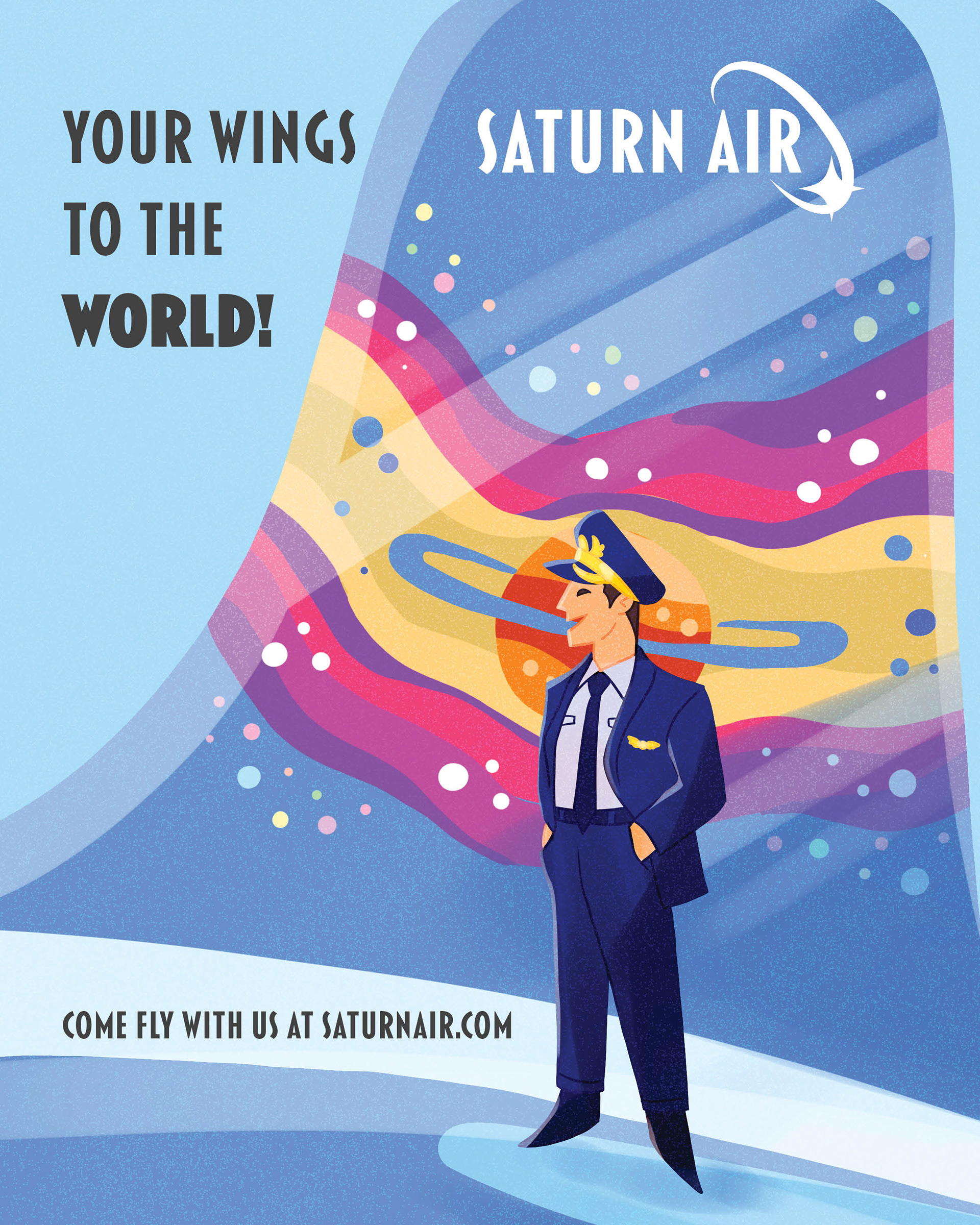
Saturn Air Advertisement
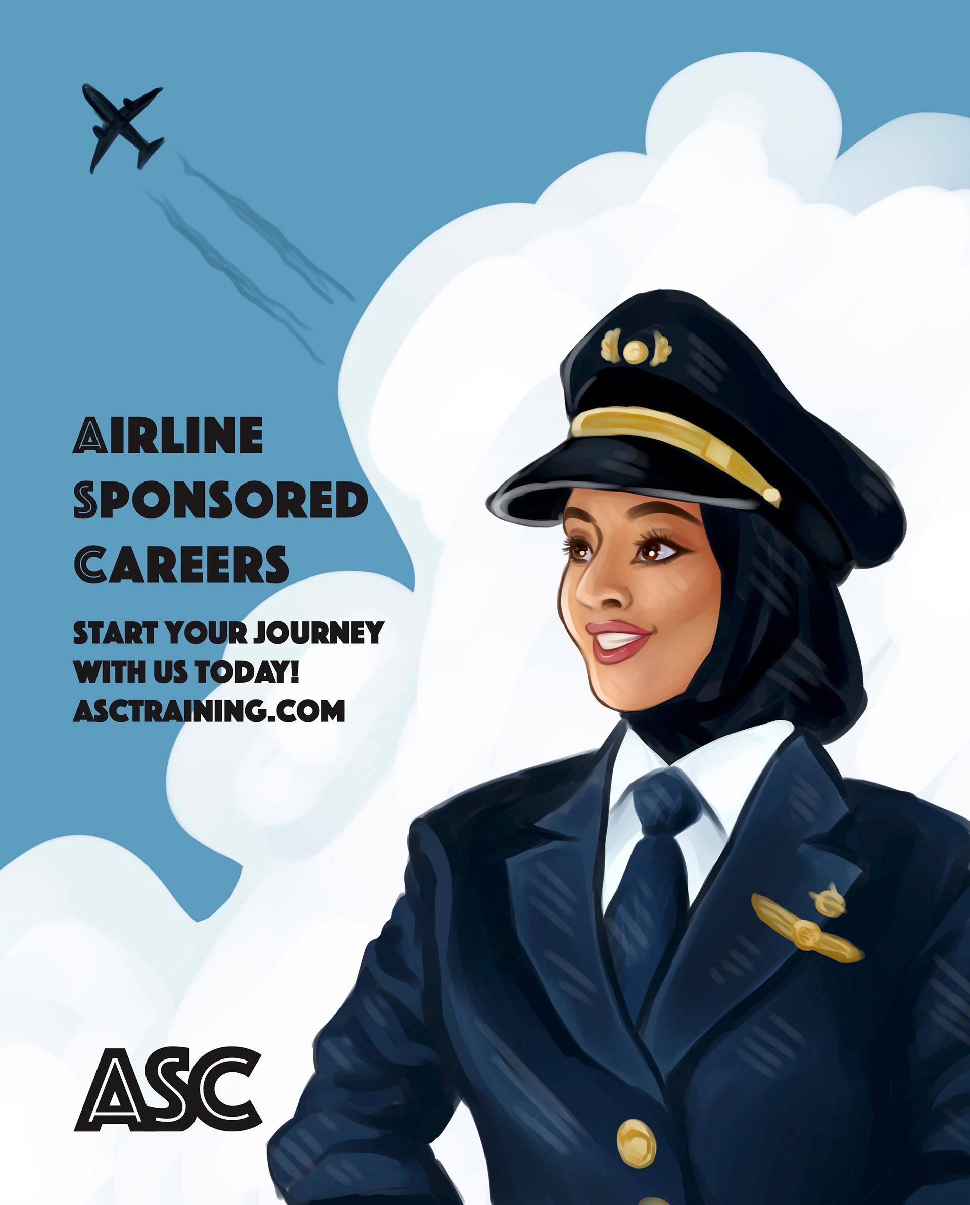
ASc Advertisement
Pilot school ad
The goal of this project was to create a second advertisement for the airline magazine that I illustrated my Saturn Air ad for.
Rather than make up another airline, I chose to create a pilot training school named "ASC". My main inspiration for this illustration was the work of J.C. Leyendecker. The suit and the lighter lines across the illustration were influenced from his style and elevated the drawing overall.
This illustration took me around 3 hours to complete, and was also featured as a page in the magazine.
Magazine Cover
This was the cover I illustrated for the airline magazine project. I chose to do a special feature on one of my favourite planes - the Boeing 747.
My main idea was to showcase the rise and fall of this aircraft's usage by the airline industry, which inspired the day-to-night transition behind the plane. I also wanted to make the plane look visually striking to viewers, which is why I exaggerated the colours to erase any bits of grey. When I drew this I was unfamiliar with the anatomy of the 747, so this turned into a fun and compelling challenge.
This illustration took me around 4 hours to complete, including time spent tweaking it after receiving feedback.
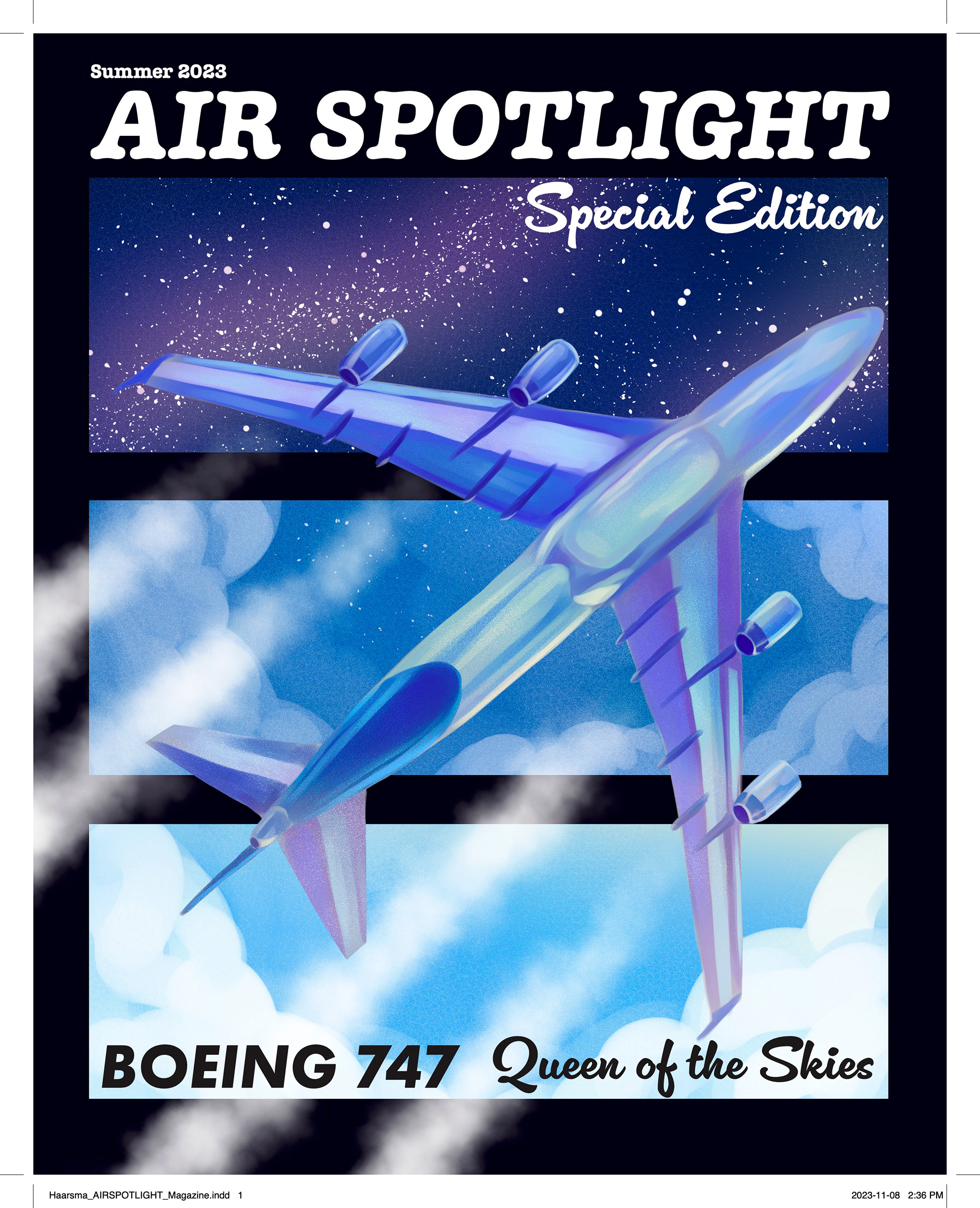
Air Spotlight Cover
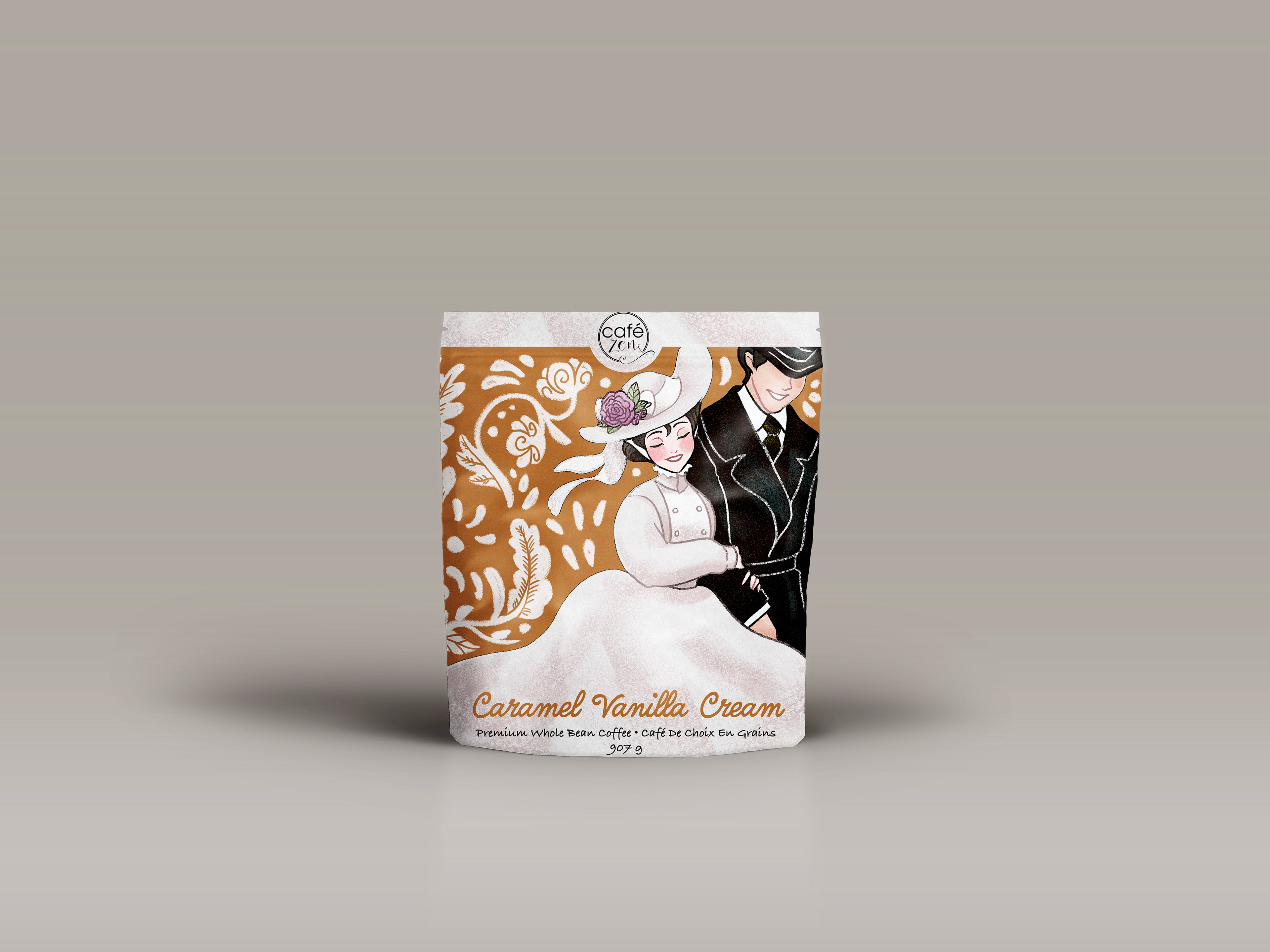
Coffee Bag Mock-up
Coffee Bag
The goal of this project was to design a coffee bag for a Stratford-based coffee company utilizing visuals associated with Stratford in the design. The design had to be illustrated with a chalk-like texture.
Going into this project, I knew I wanted it to appear unique from other visuals often utilized from Stratford. I chose to showcase a fashionably dressed couple - perhaps on their way to a play - strolling across the packaging. I based the colour scheme off the caramel vanilla cream flavour, with white patterns in the background mimicking latte art. Overall, I pursued a light and airy feeling to convey through this project.
This illustration was completed over the course of several weeks with feedback from both my peers and my professor.
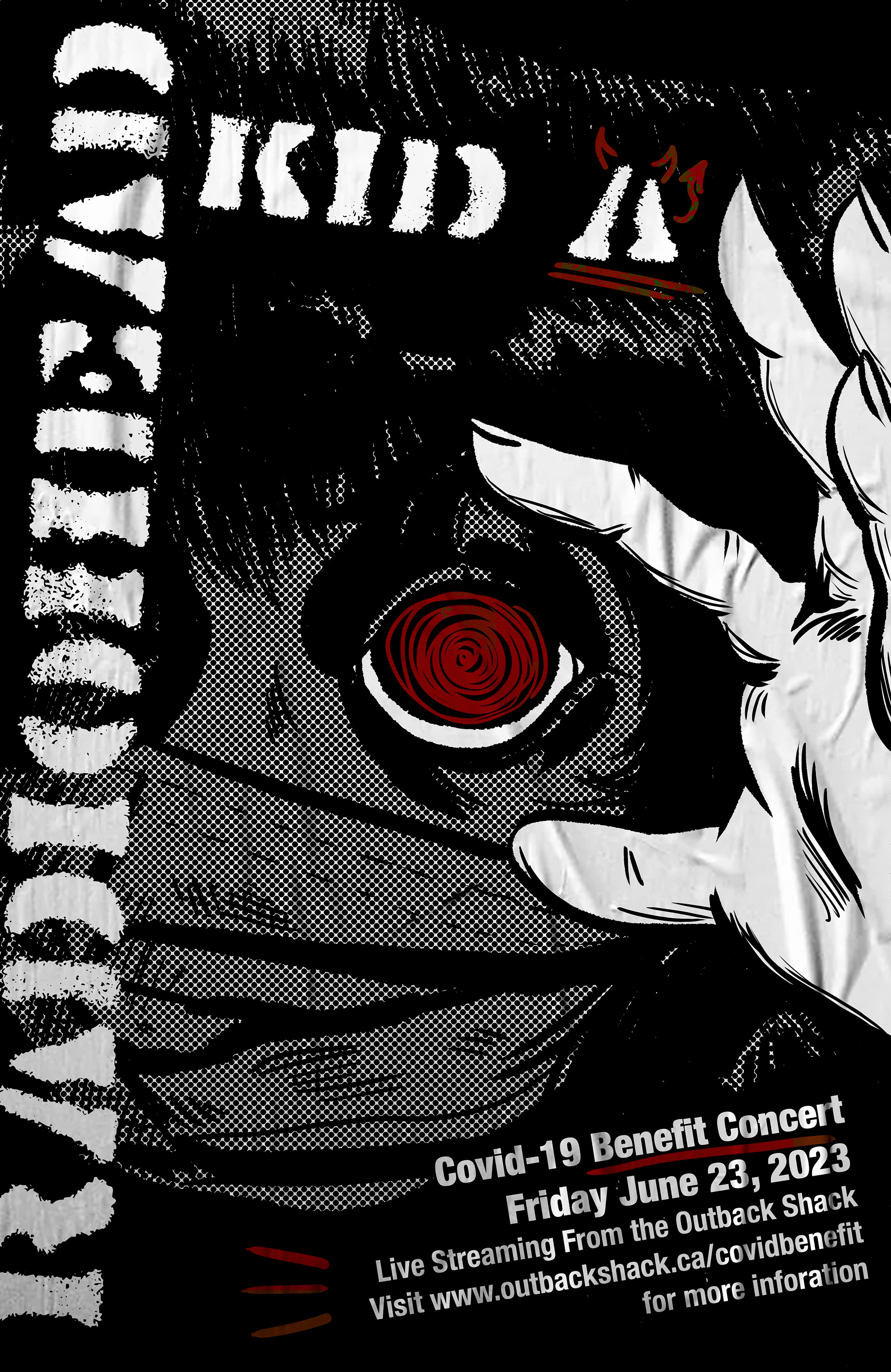
Conceptual concert poster
The goal of this project was to design a concert poster for the album that was most popular the week you were born. As a result, I was given Kid A by Radiohead.
As someone who does not listen to Radiohead, this project was an interesting venture from my usual style. The album had a bit of a grunge feel to it, which I chose to show through a rougher font and halftone dots. I wanted to convey a person opening their eyes to a different reality. To accomplish this, I use halftone dots to cover the image and add emphasis to the pure white hand opening the eye, which is the only other part of the illustration to contain pure white. This project was a challenge that I greatly enjoyed.
This illustration went through many phases and was completed over the course of several weeks with feedback from my professor.
Radiohead Kid a poster